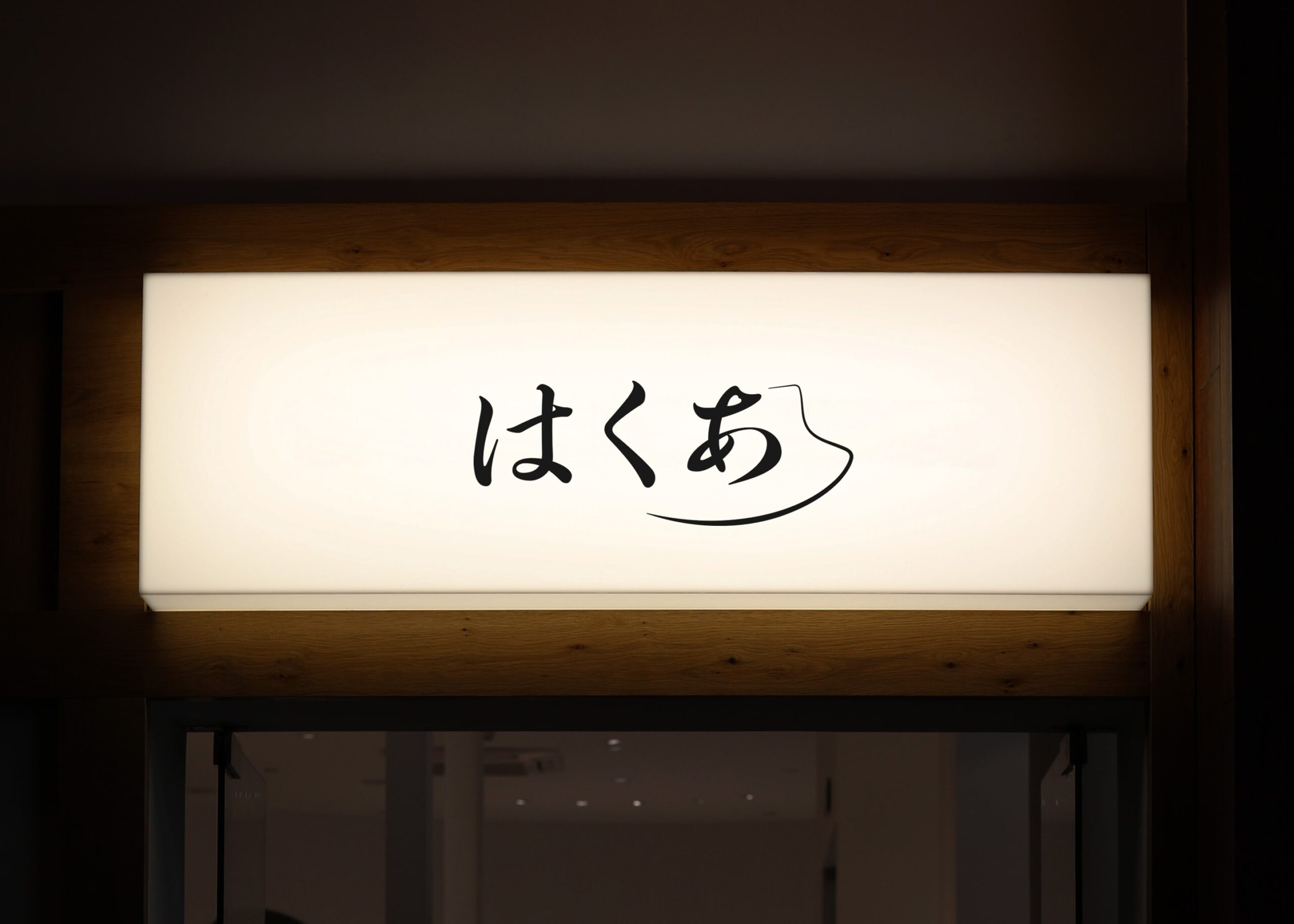
HAQA
Year: 2023
Client: HAQA
Service: Logo design, Business card
Art direction and design: Shiina
Logo and business cards for a new company
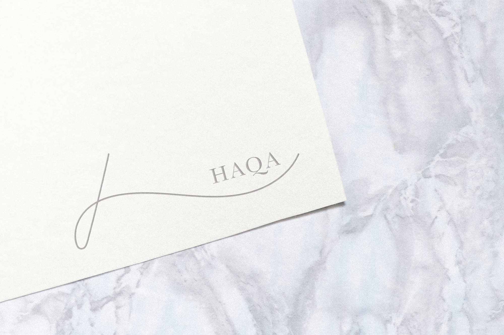
Logo
The logo for HAQA is designed with a single continuous line that integrates the letters h, a, and q seamlessly. This line embodies the clean, fresh, and flowing essence reminiscent of water, aligning with the serene imagery evoked by the name HAQA.
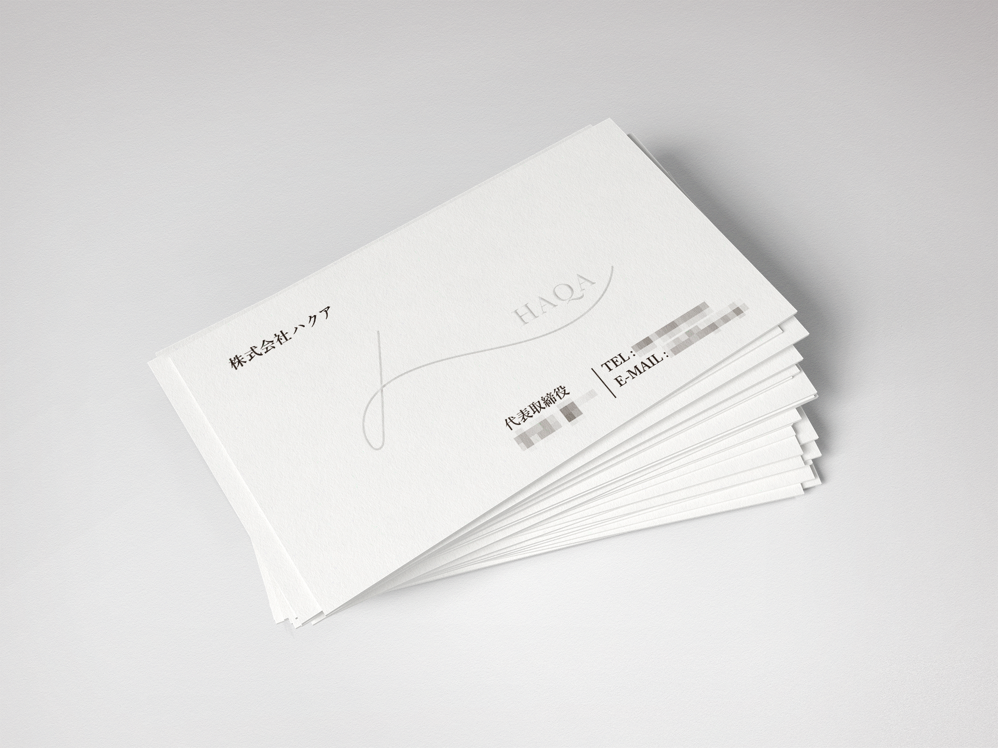
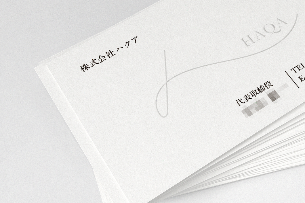
Business Card
The business card features a minimalist design in pure white, echoing the simplicity and elegance of HAQA. The HAQA logo is embossed in the centre, achieving a subtle yet impactful look that strikes a balance between sophistication and understatement.
新しい会社設立に伴ったロゴ、名刺の作成
ロゴは、HAQAのh、a、qをすべて1本の線で表現しています。また、このラインは、HAQAという名前に含まれる、「水のように流れる」「白のクリーンでフレッシュ」なシンプルなイメージから生まれました。
名刺も真っ白でシンプルなデザインにしています。中央のくぼみにHAQAのロゴをエンボス加工することで、派手すぎず、控えめすぎないバランスを心がけました。
Selected Works
Other selected worksSelected works
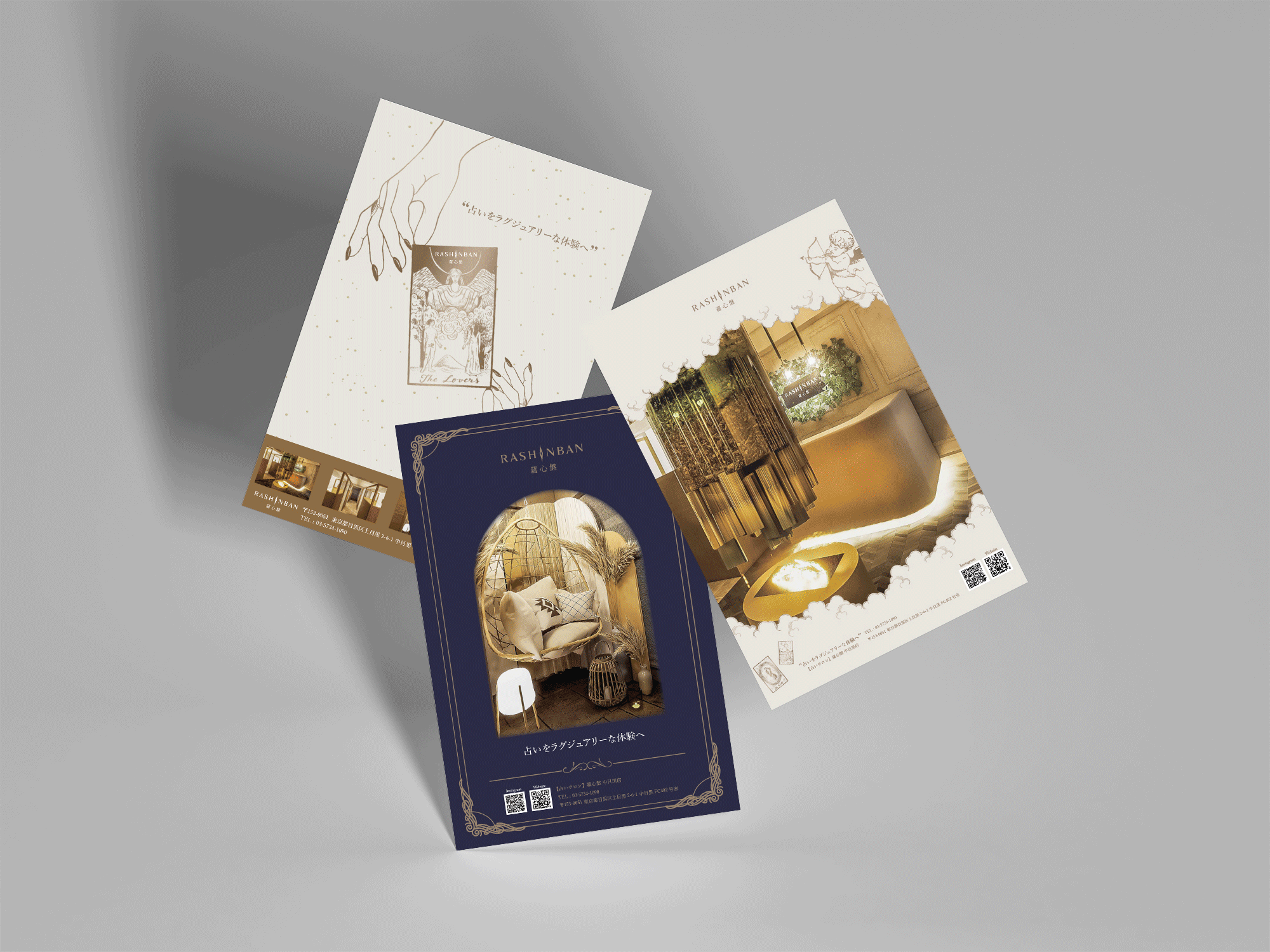
RashinbanBrand Collateral
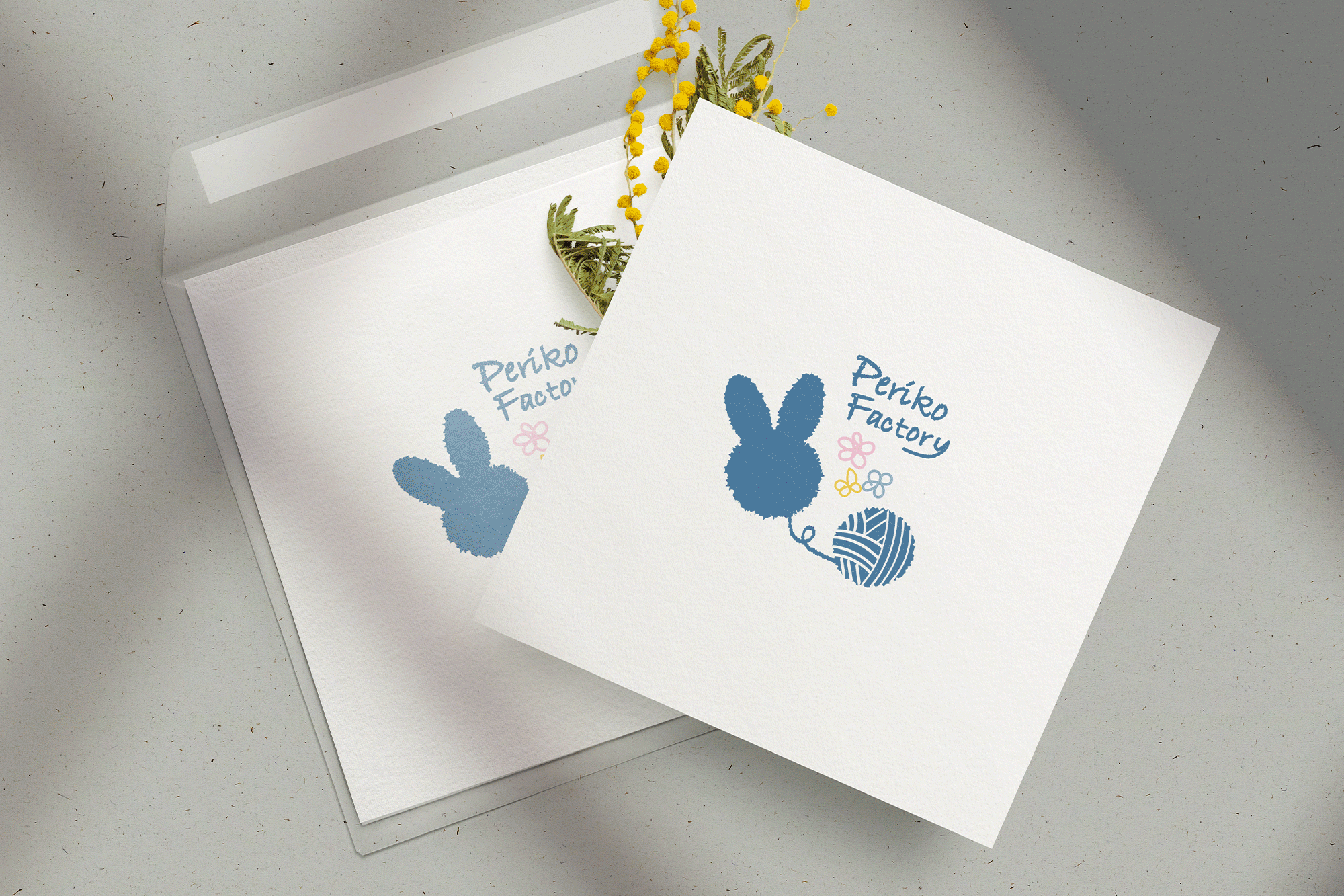
HaqaBranding design
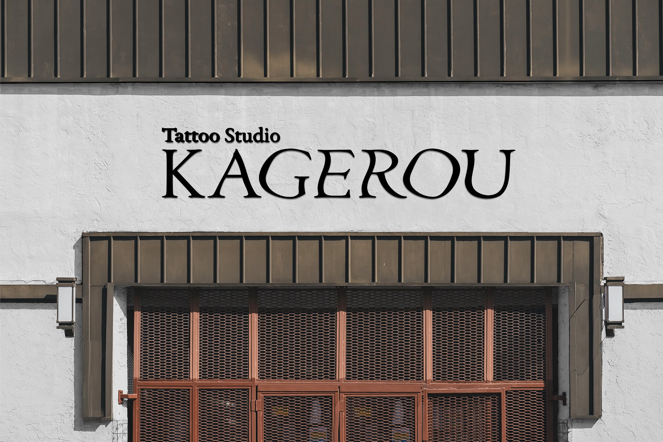
KAGEROUBranding design
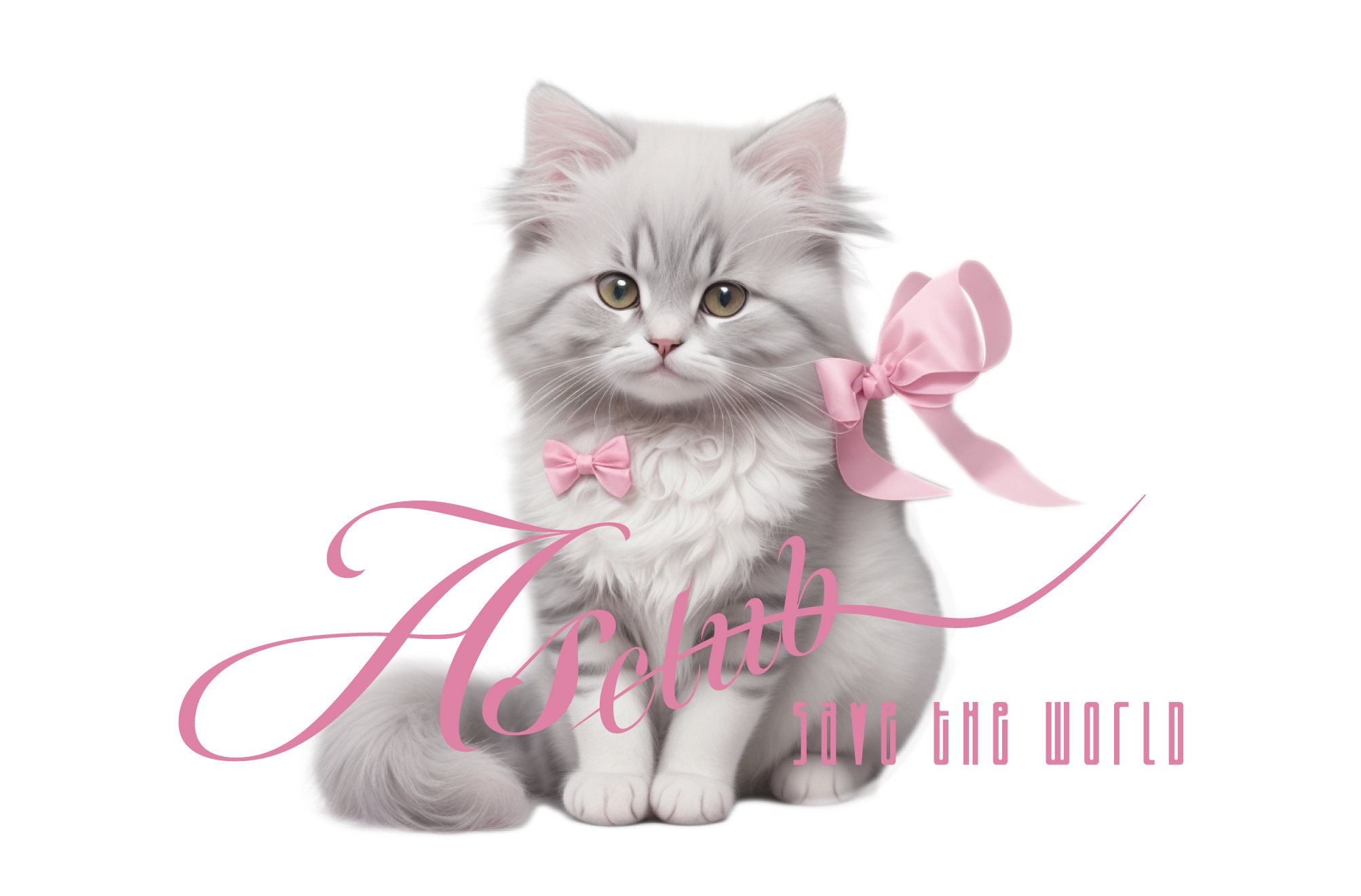
As clubBranding design
Selected Logo CollectionLogo design
Selected Poster and Flyer CollectionPoster and Flyer design
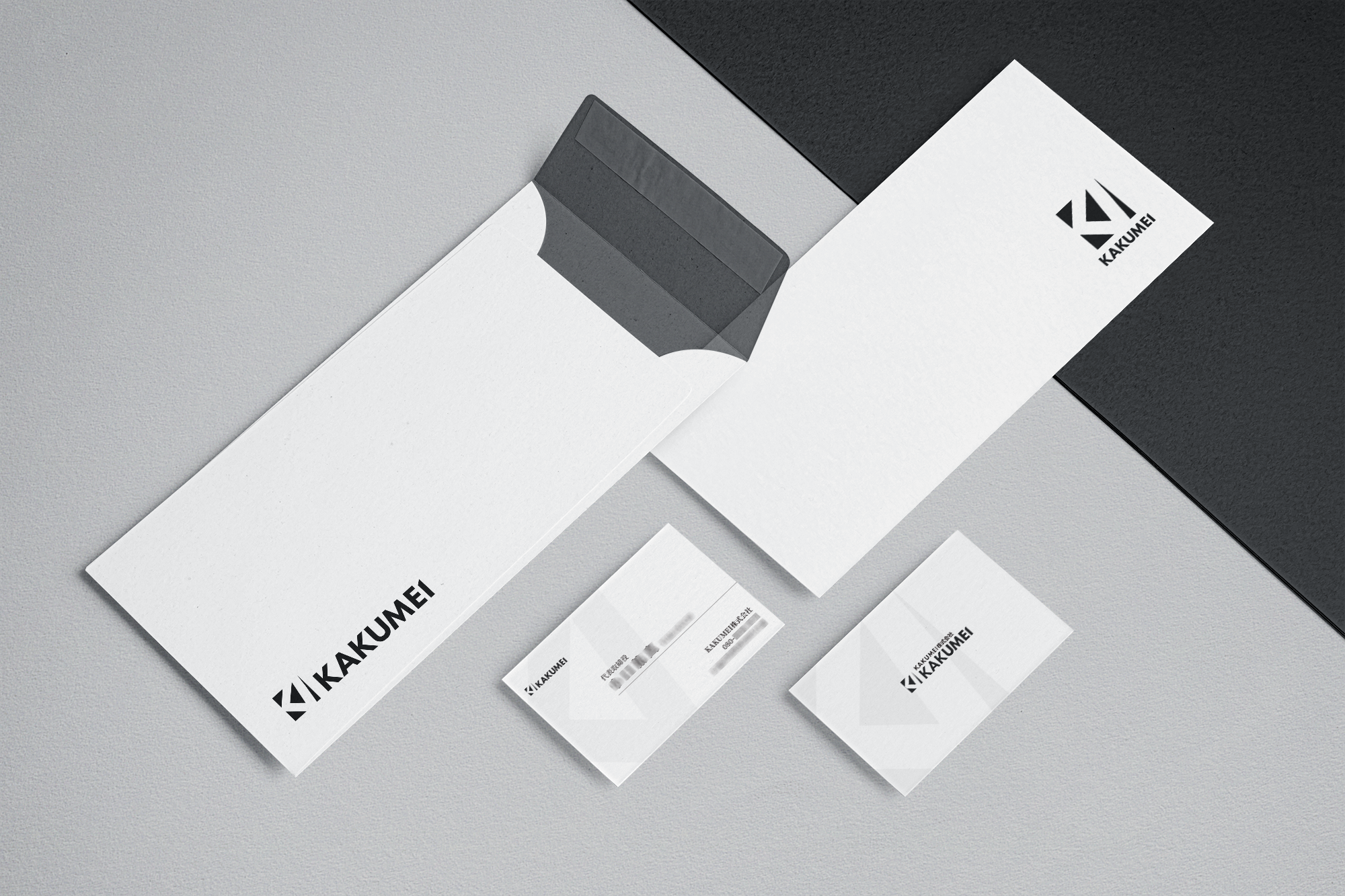
KAKUMEILogo design, Business card design
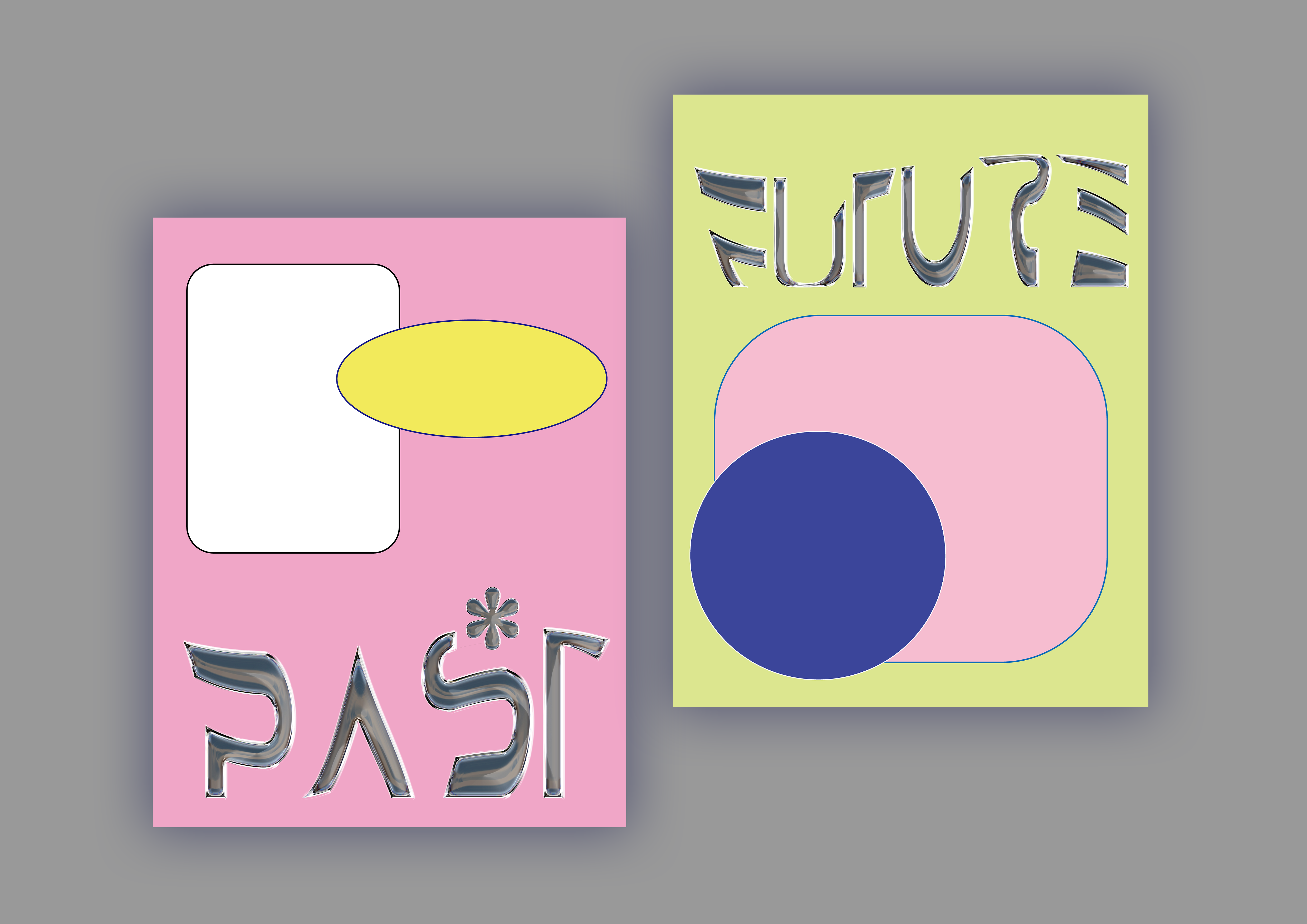
Past Future ExhibitionPast Future Exhibition
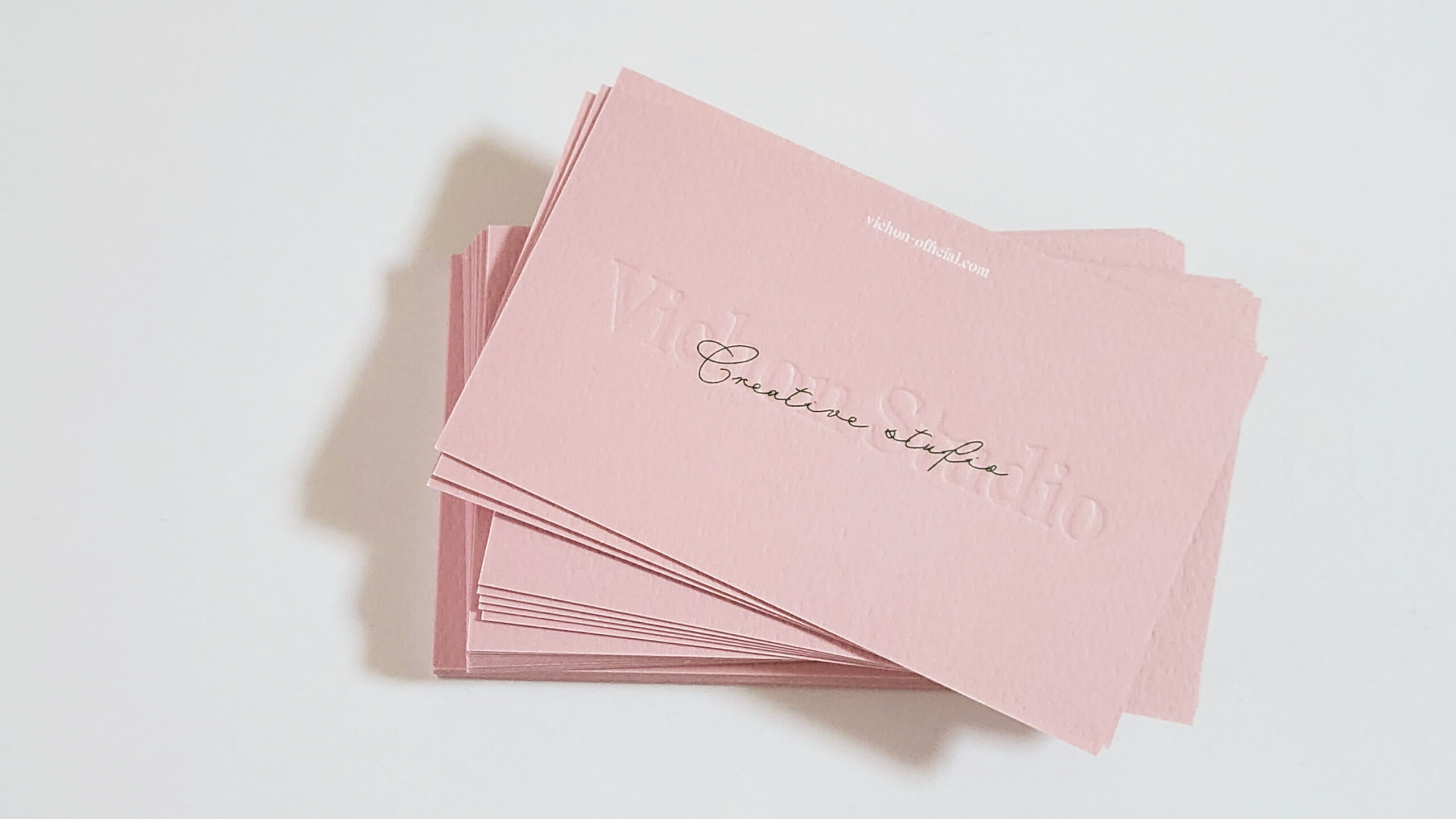
Vichon StudioLogo, business card design
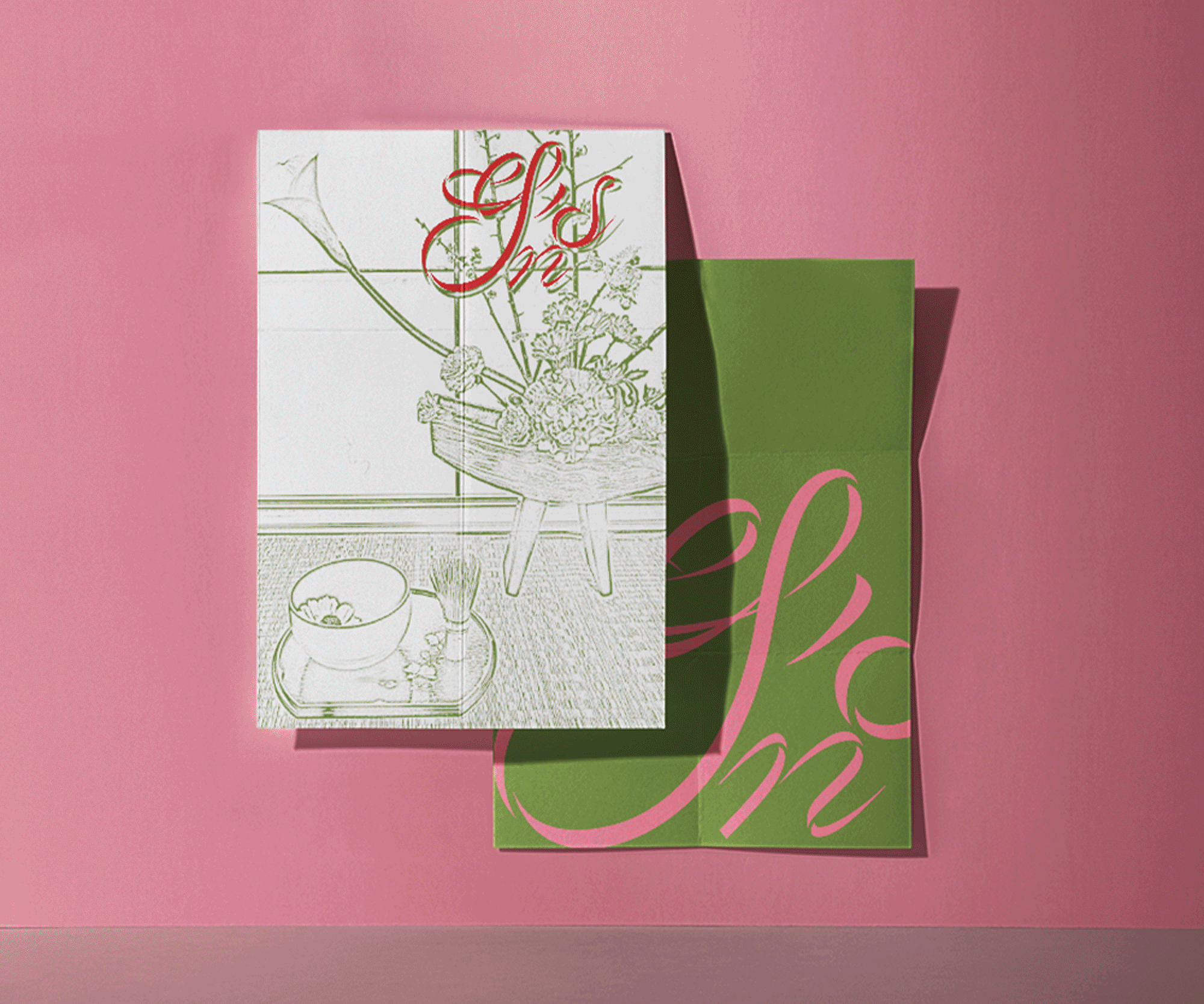
Sen,s JapanBranding design
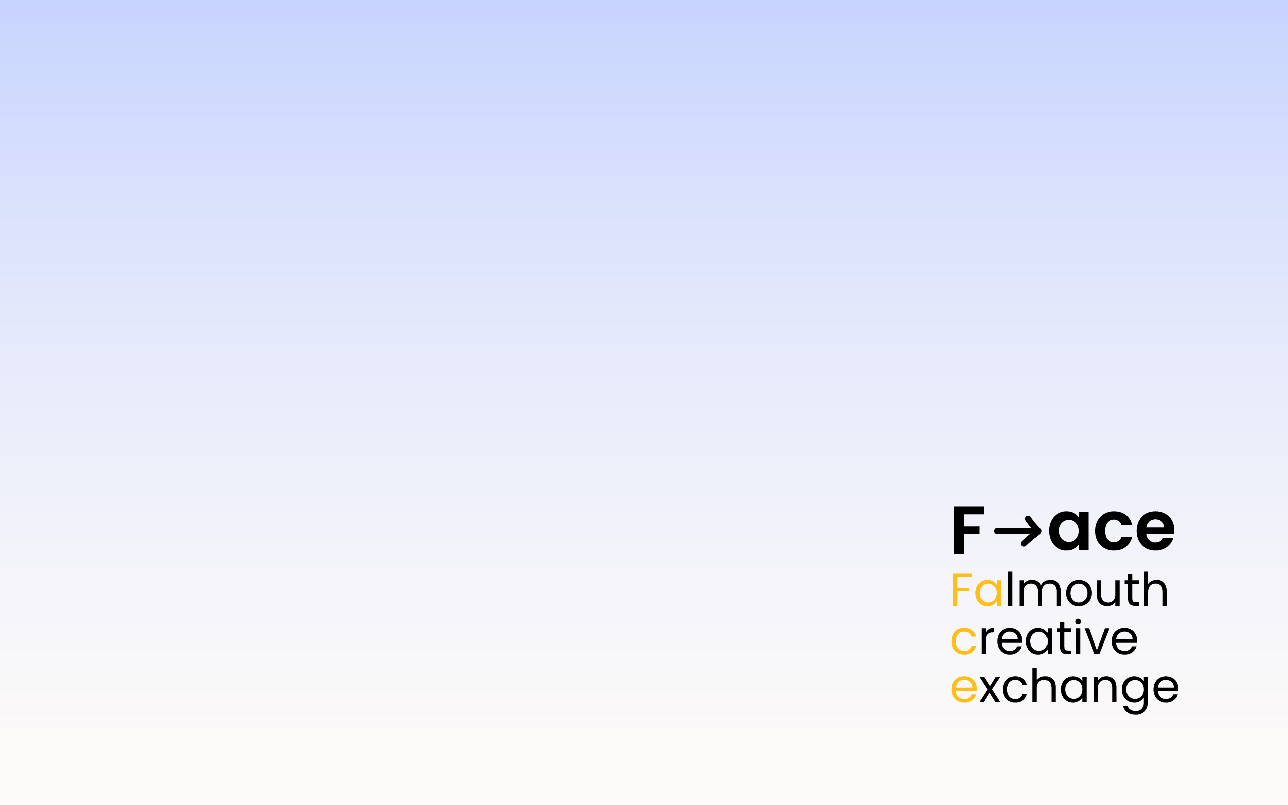
F→aceUI UX design
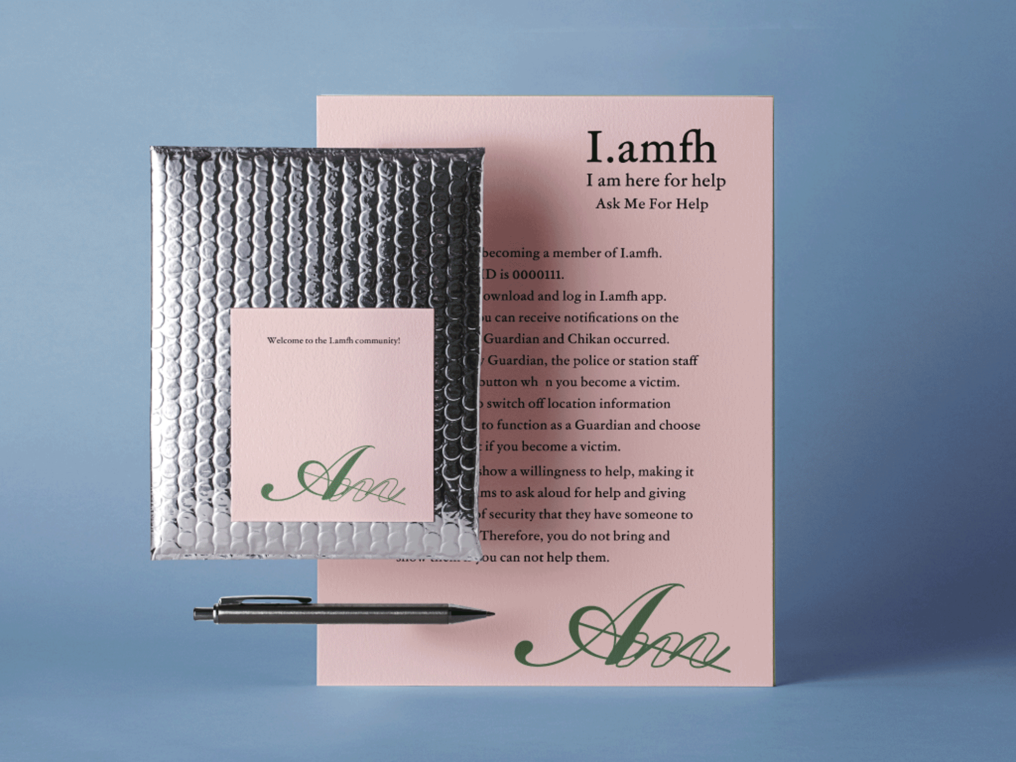
I.amfhBranding design
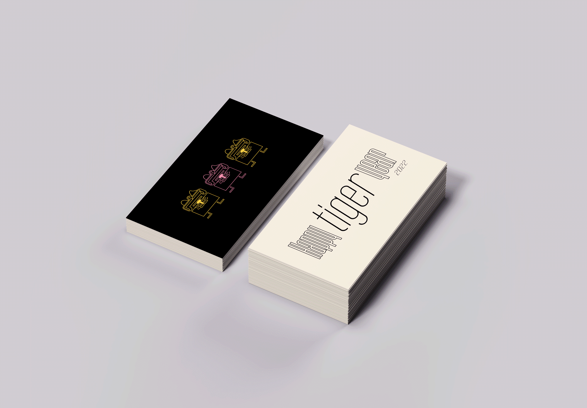
Happy Tiger year 2022Branding design
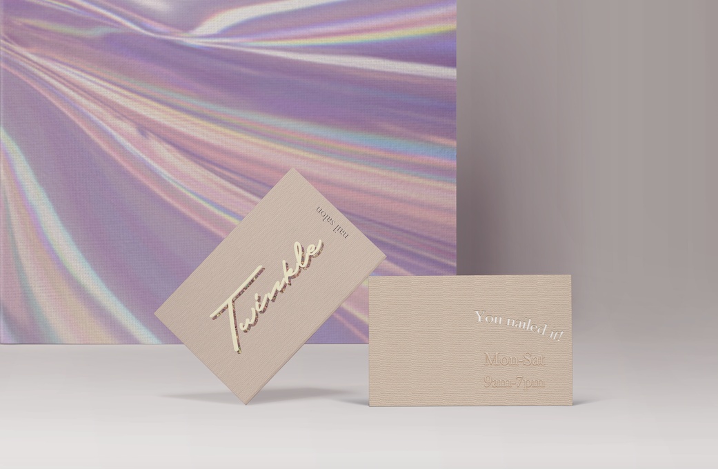
Twinkle Nail SalonBrand Identity design
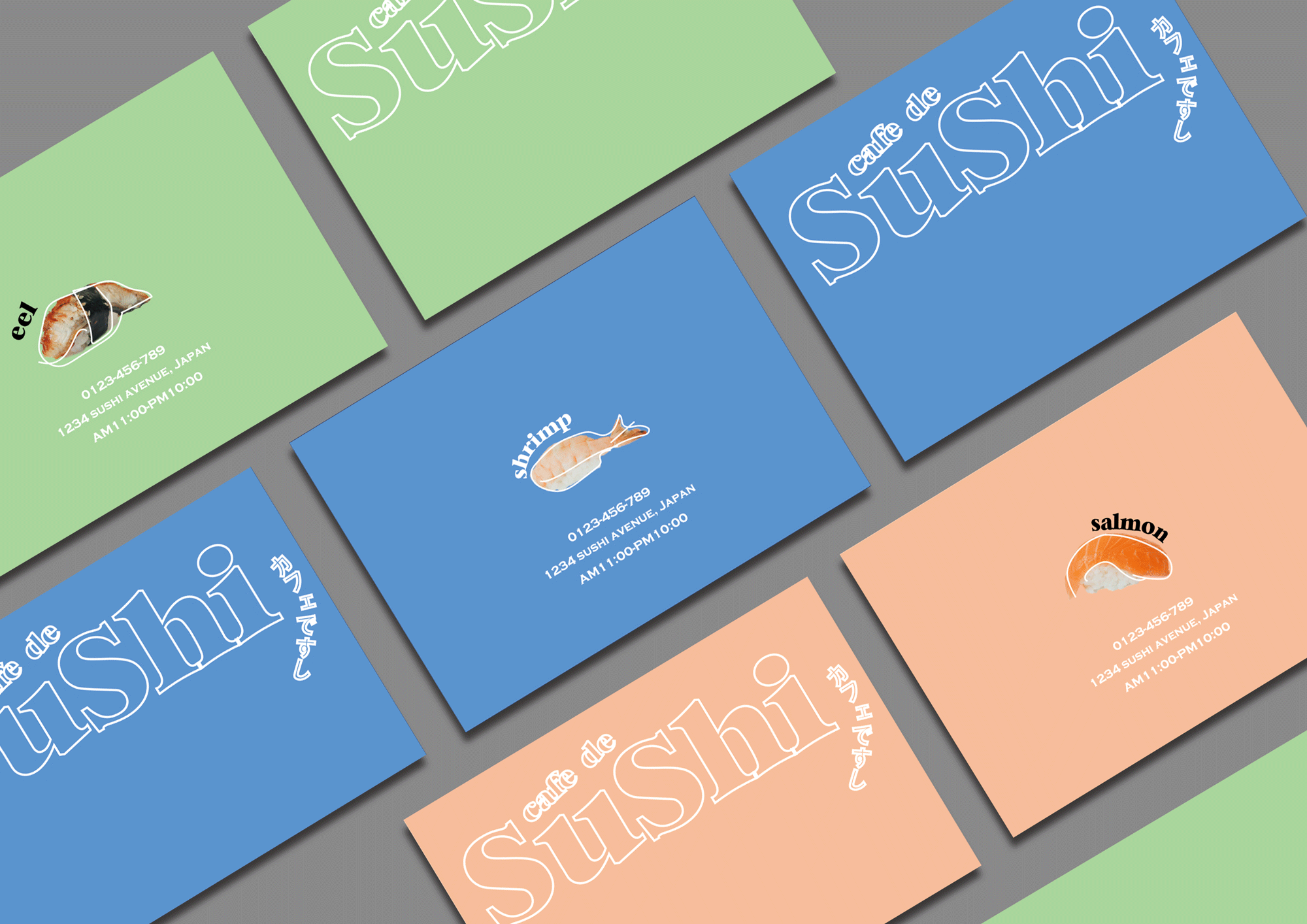
Cafe de SuShiBranding design
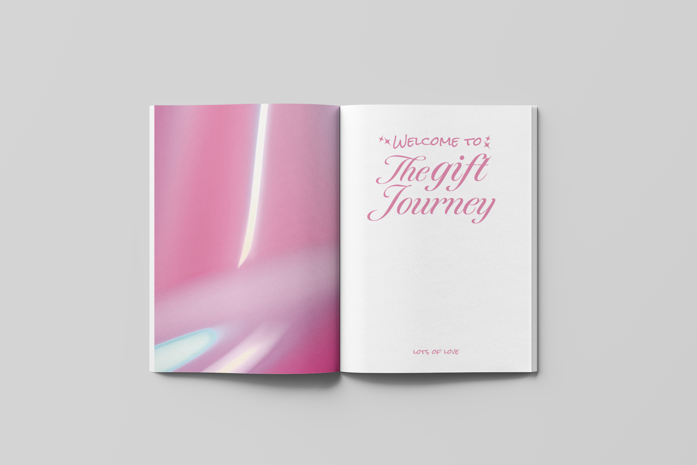
Our Gift and Love ZineZine design